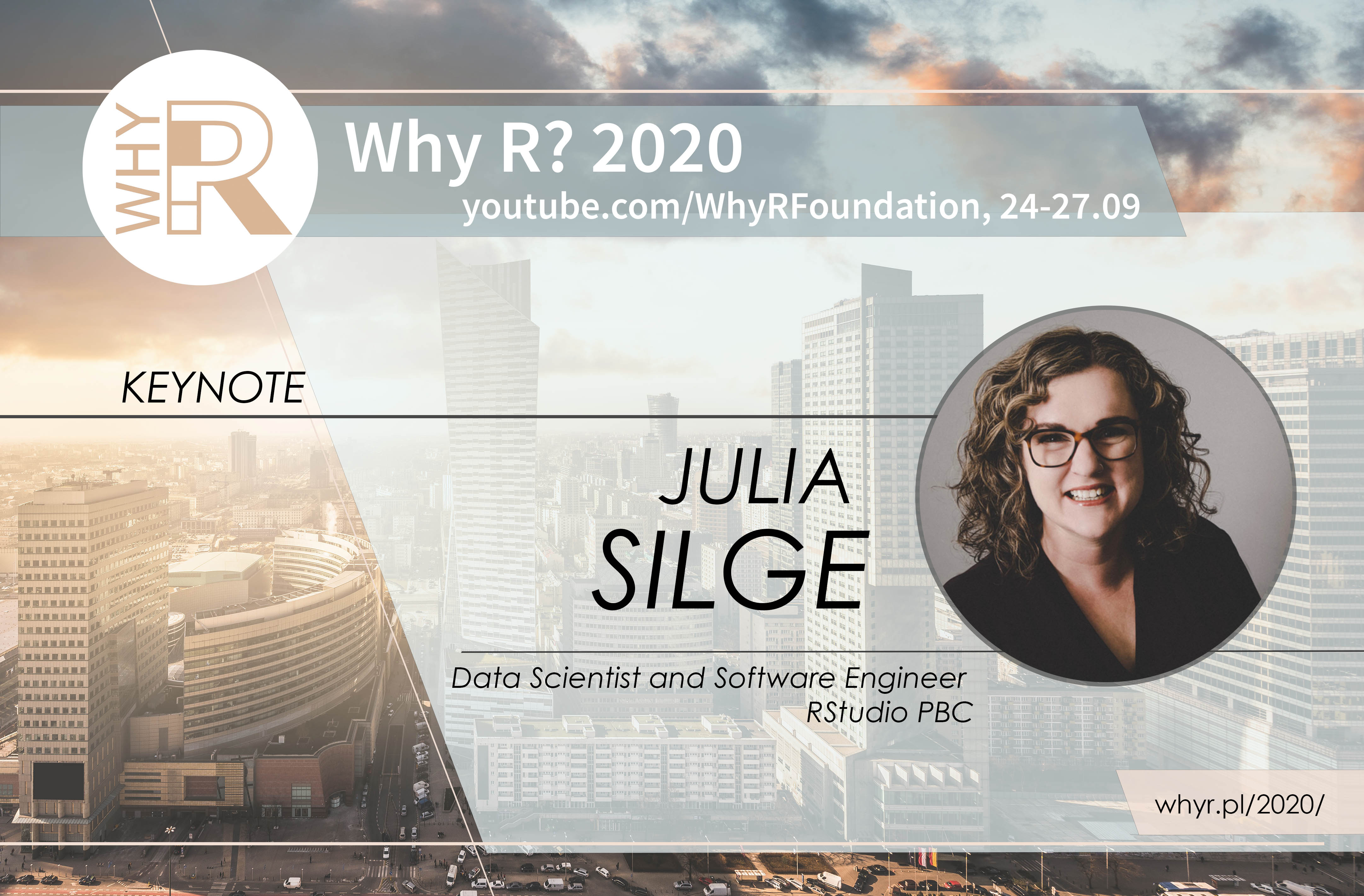
 Few weeks ago we finished Why R? 2020 conference. We had an honour to host Julia Silge, a data scientist and software engineer at RStudio PBC. This post contains a biography of the speaker and an abstract of her talk: Data visualization for machine learning practitioners.
Visual representations of data inform how machine learning practitioners think, understand, and decide. Before charts are ever used for outward communication about a ML system, they are used by the system designers and operators themselves as a tool to make better modeling choices. Practitioners use visualization, from very familiar statistical graphics to creative and less standard plots, at the points of most important human decisions when other ways to validate those decisions can be difficult. Visualization approaches are used to understand both the data that serves as input for machine learning and the models that practitioners create. In this talk, learn about the process of building a ML model in the real world, how and when practitioners use visualization to make more effective choices, and considerations for ML visualization tooling.
Julia Silge is a data scientist and software engineer at RStudio PBC where she works on open source modeling tools. She is an author, an international keynote speaker, and a real-world practitioner focusing on data analysis and machine learning practice. Julia loves text analysis, making beautiful charts, and communicating about technical topics with diverse audiences.
